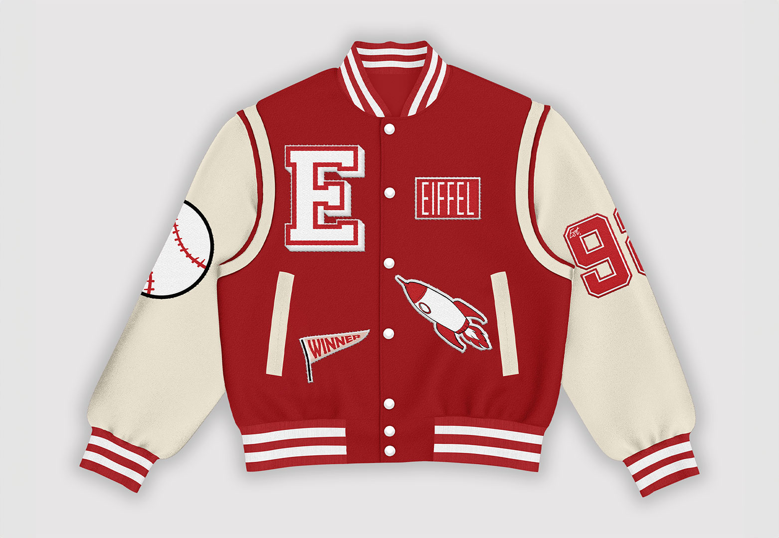
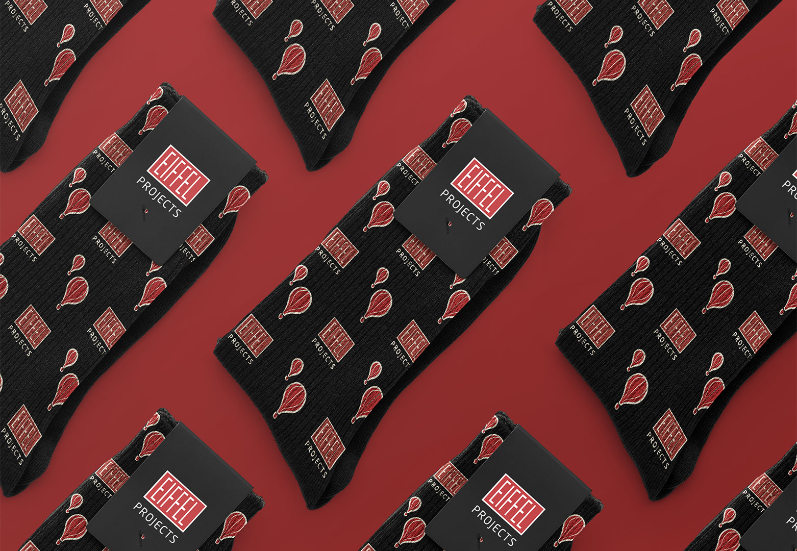
During my internship at the Marketing & Communications department of EIFFEL in Arnhem, I worked on a wide range of projects and gained valuable experience. A small selection of these projects is highlighted here. For example, I designed a baseball jacket for EIFFEL that was worn by employees when visiting schools and universities. It was a successful internship during which I learned many different skills.
CATEGORY: INTERNSHIP
CLIENT: EIFFEL
TOOL: ADOBE PHOTOSHOP
YEAR: 2023
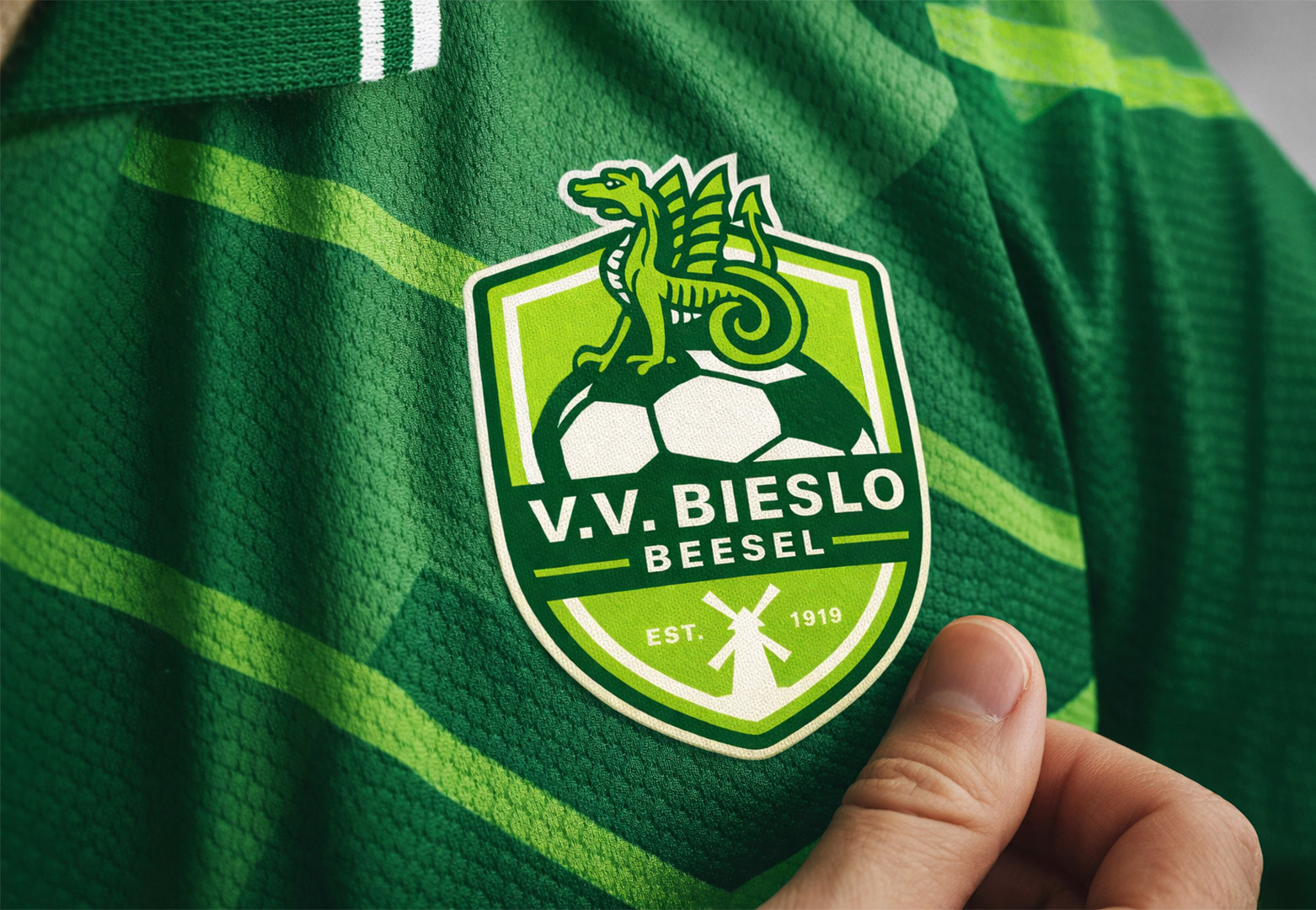
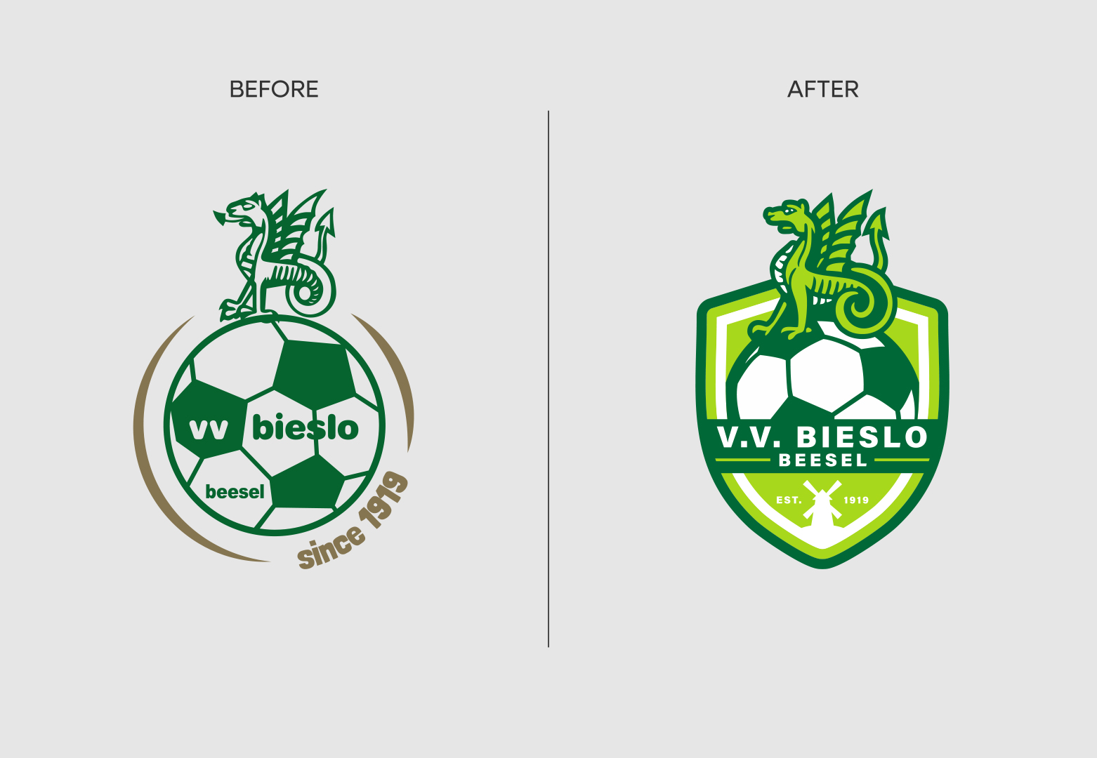
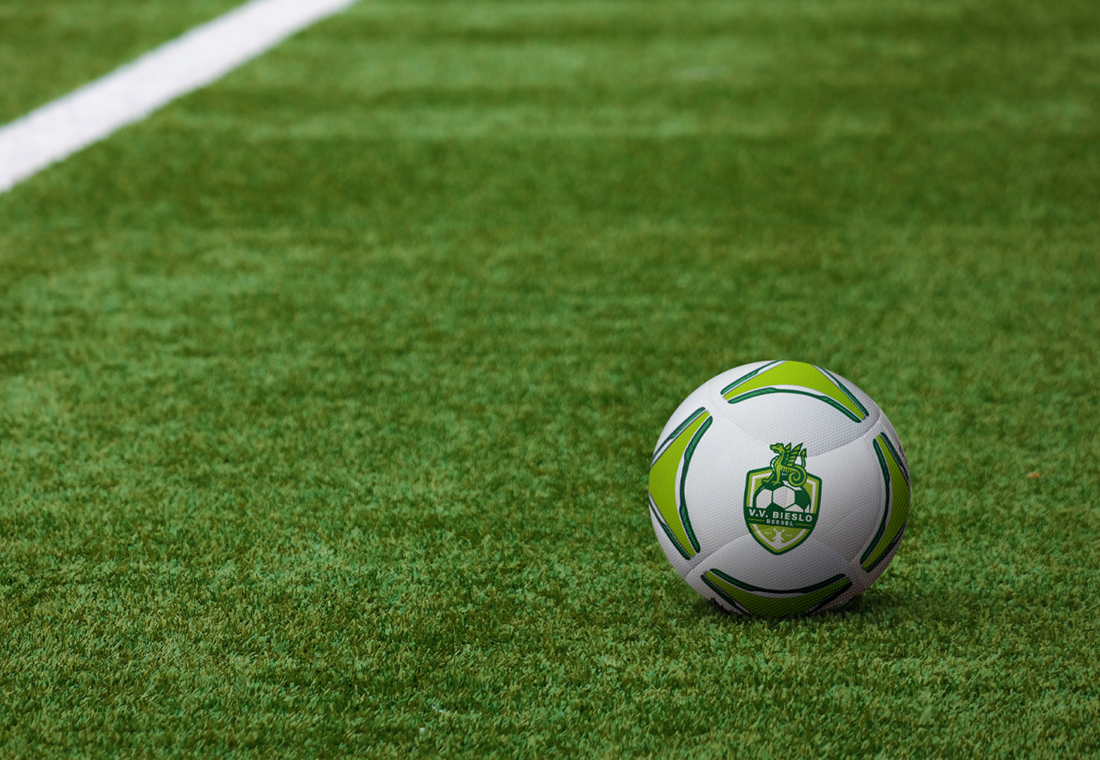
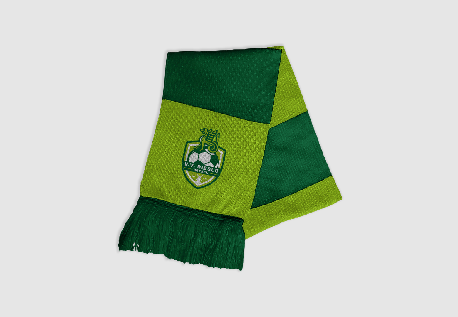
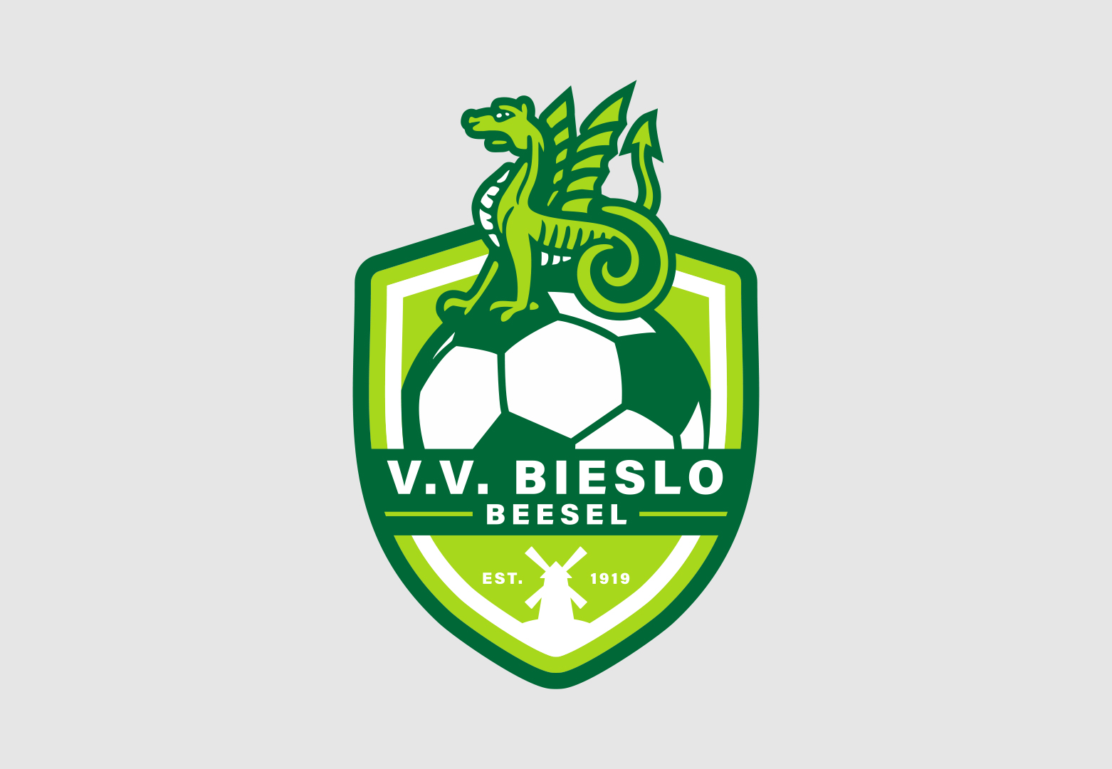
V.V. BIESLO
V.V BIESLO - LOGO REDESIGN
I designed a new logo for a football club in the Netherlands called: v.v. Bieslo. The previous logo felt dated and no longer reflected the club’s ambitions, so it was time for a refresh. While modernizing the design, it was important to preserve key elements from the original logo in order to maintain the club’s recognizable identity and sense of heritage.
Beesel is known for ’the Draaksteken’, a large open-air play that is performed in the village every seven years, which is why there is also a metal dragon there. For this reason I kept the dragon detail on the football from the old logo. At the bottom, I added De Grauwe Beer, a historic windmill located in Beesel.
CATEGORY: LOGO
CLIENT: V.V. BIESLO
TOOL: ADOBE ILLUSTRATOR
YEAR: 2026
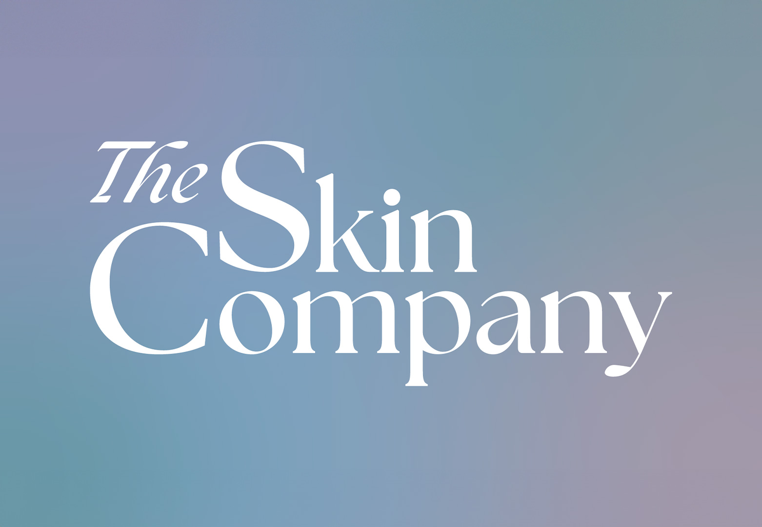
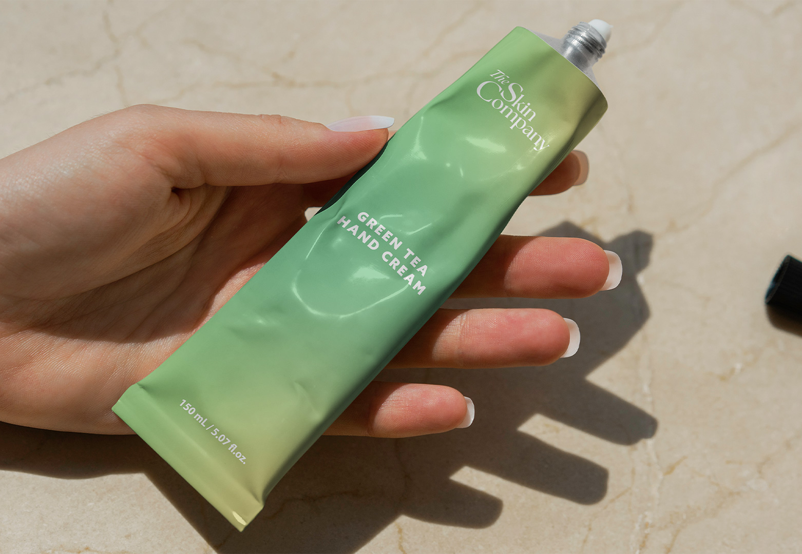
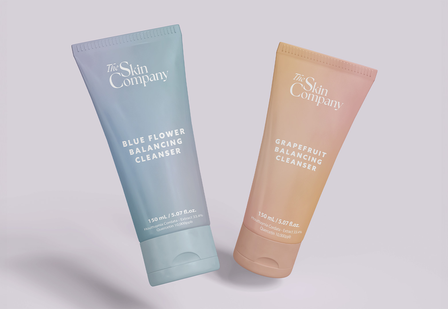
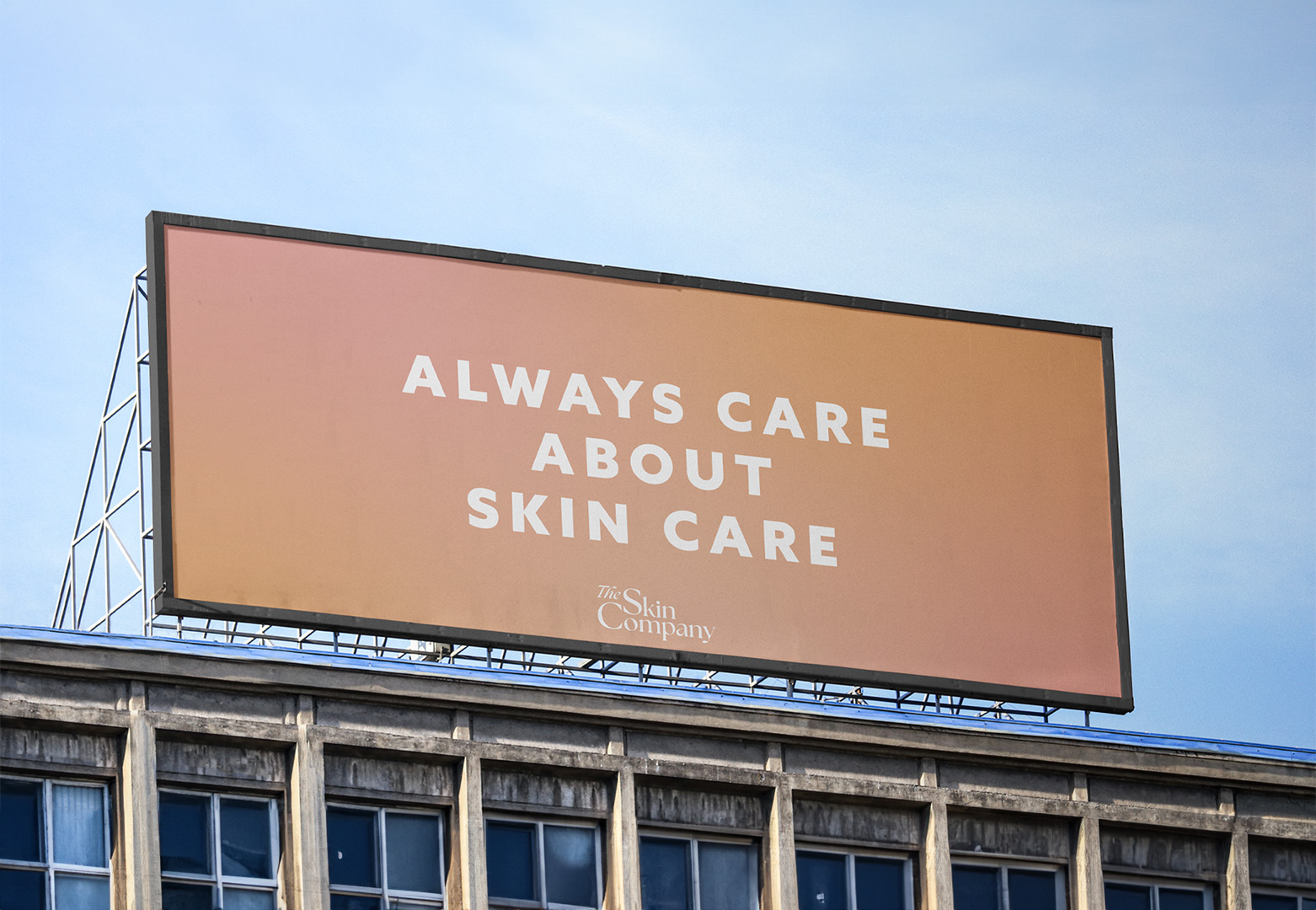
THE SKIN COMPANY
THE SKIN COMPANY - LOGO DESIGN
For an online design contest, I designed a logo for The Skin Company with the goal of combining elegance and approachability. The serif typeface gives the logo a classic, refined look, while the playful arrangement of the letters adds warmth and friendliness. Additionaly, I used a gradient, enabling versatile application across packaging in multiple colors.
CATEGORY: LOGO
CLIENT: THE SKIN COMPANY
TOOL: ADOBE ILLUSTRATOR
YEAR: 2024
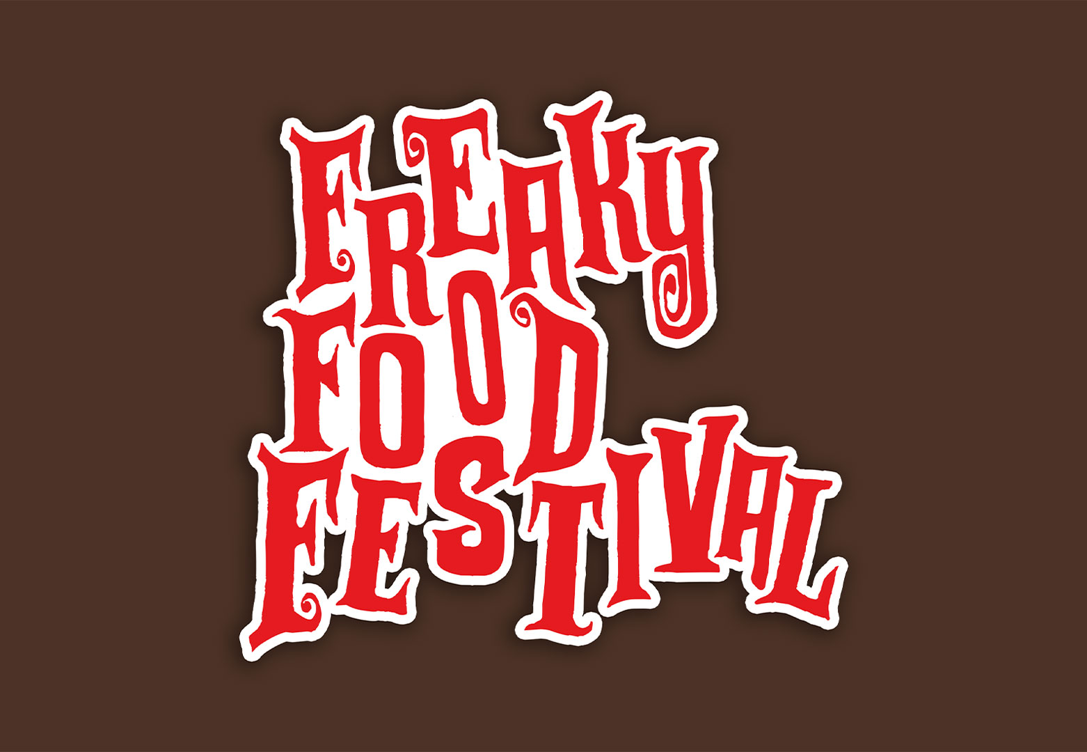
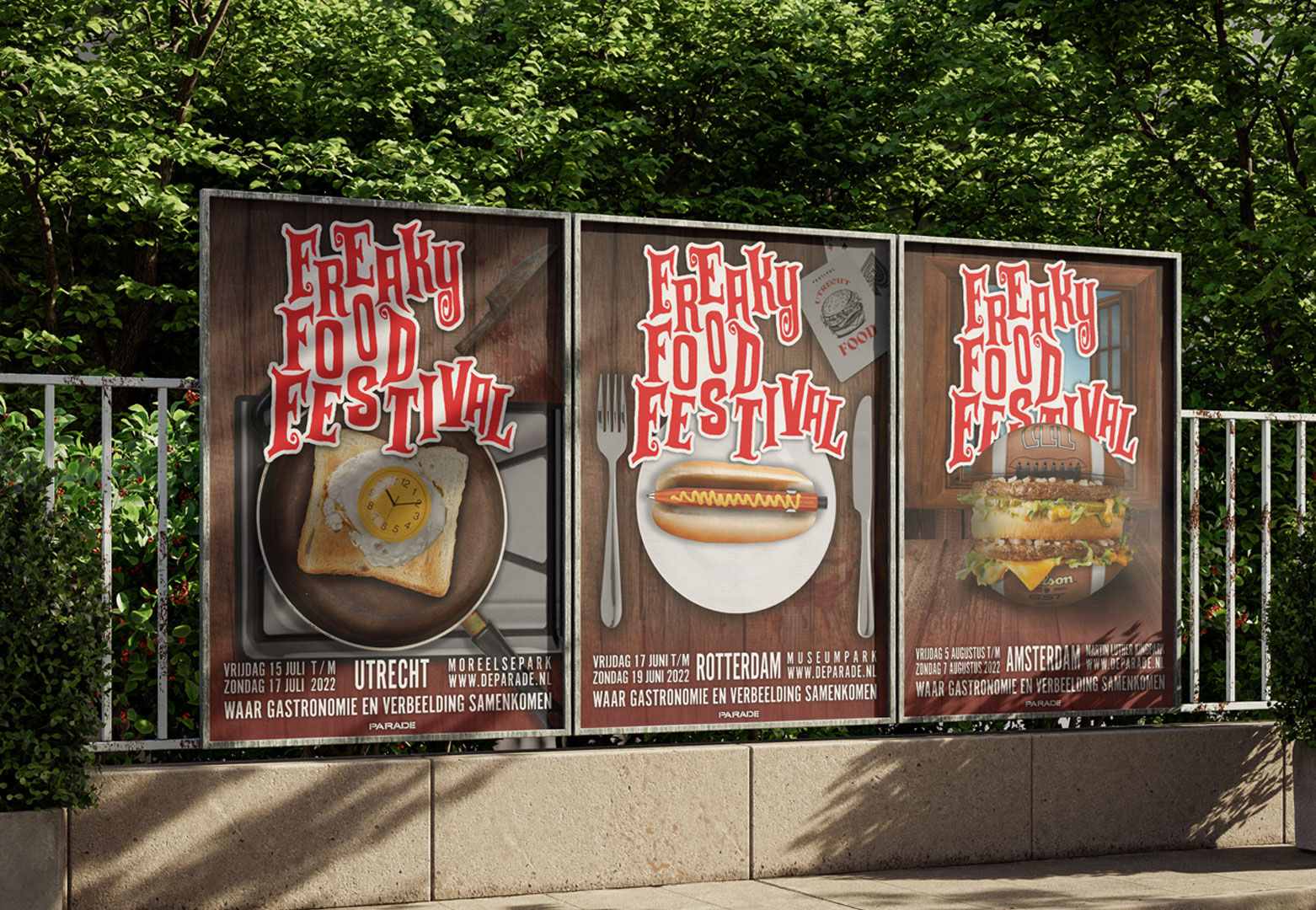
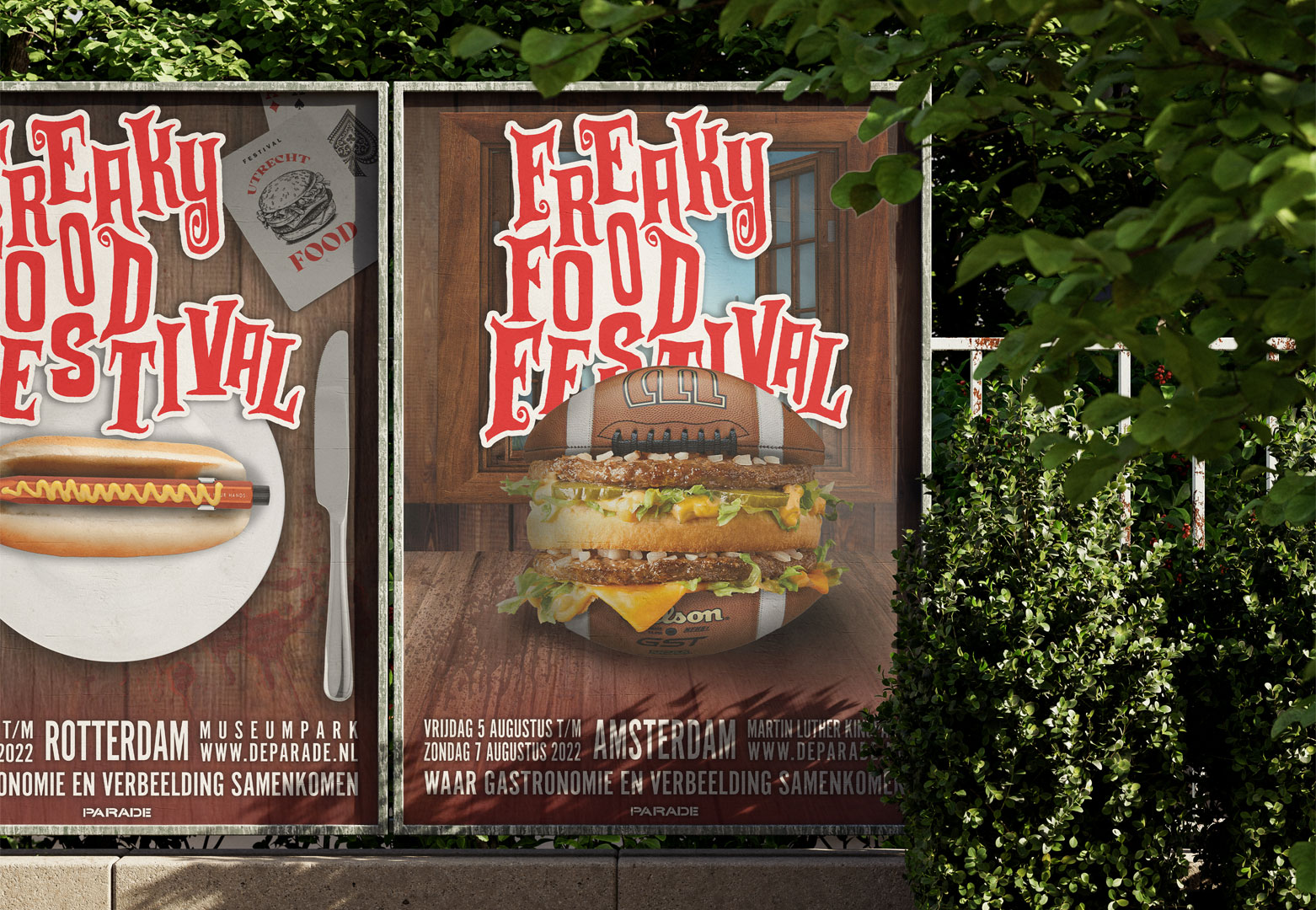
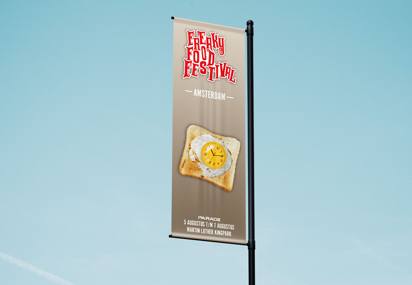
FREAKYFOODFESTIVAL
FREAKYFOODFESTIVAL - ACADEMIC PROJECT
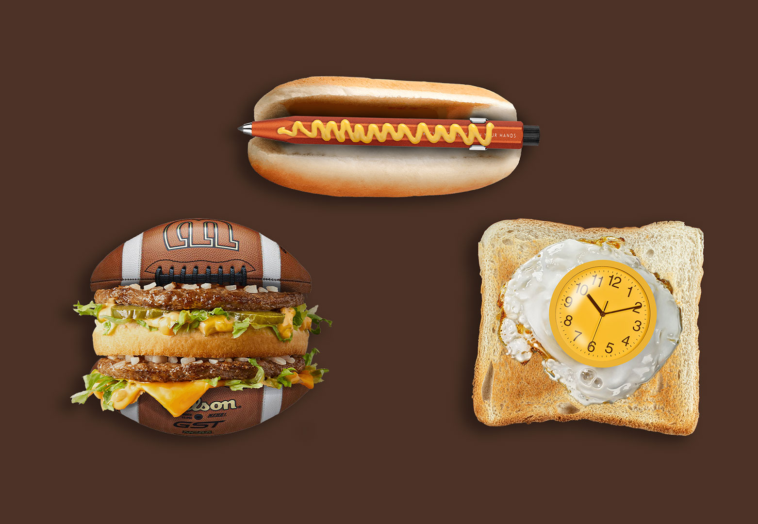
For my study, I had to design a series of posters for the FreakyFoodFestival, a festival where unusual food is combined with music. I also had to come up with a concept, and I decided to combine food with everyday objects. At first glance, the posters appear to show normal dishes, but if you look closer, you’ll see that the fried egg is actually a clock, the hotdog is made from a pen, and the burger is an American football. In addition, I played with typography to design a logo that fits this American western style.
CATEGORY: POSTER
CLIENT: FICTIONAL
TOOL: ADOBE PHOTOSHOP
YEAR: 2022
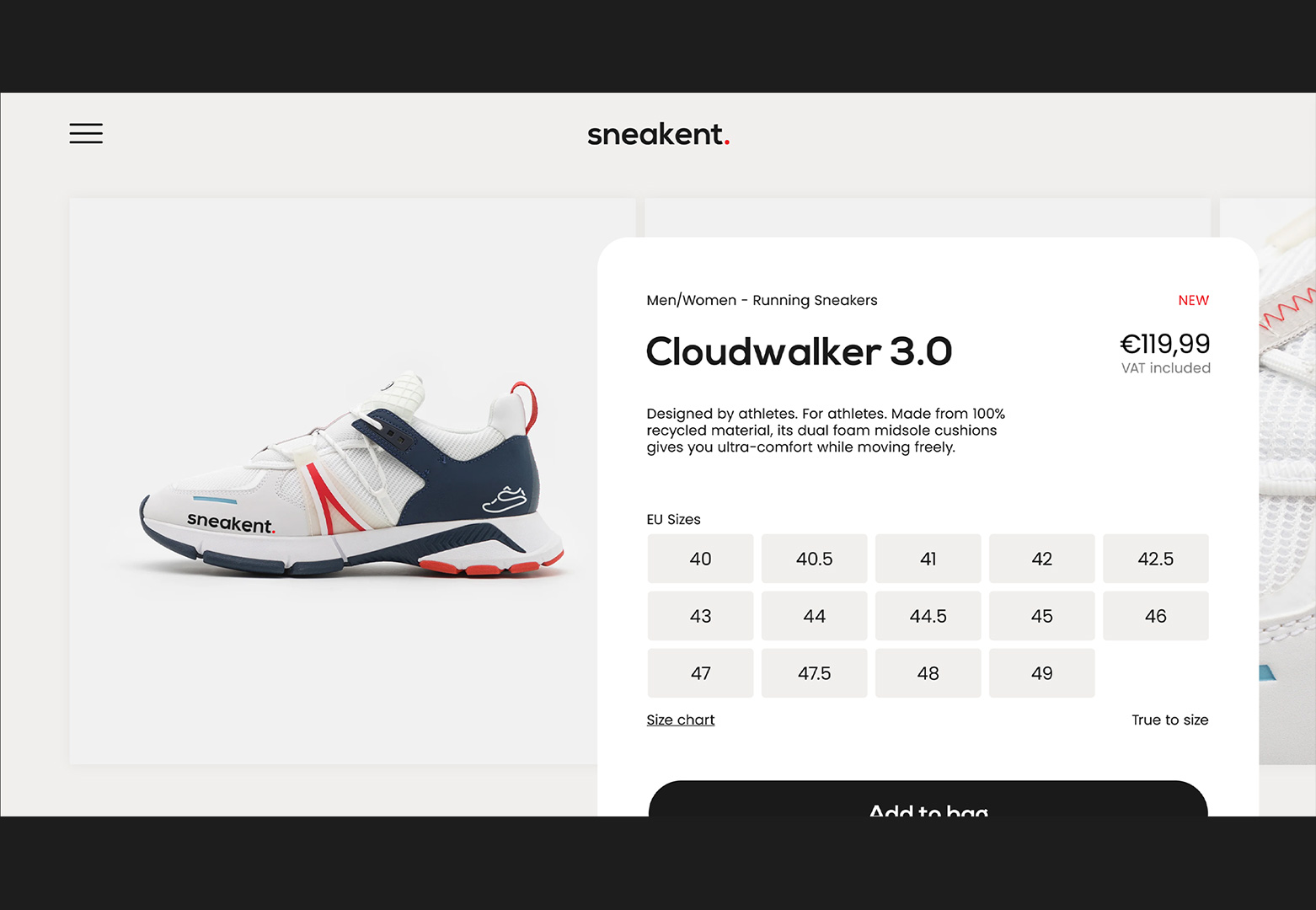
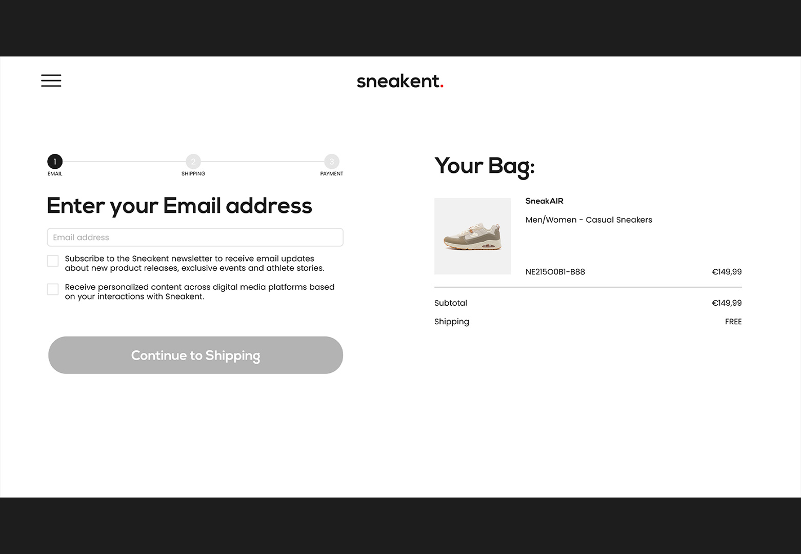
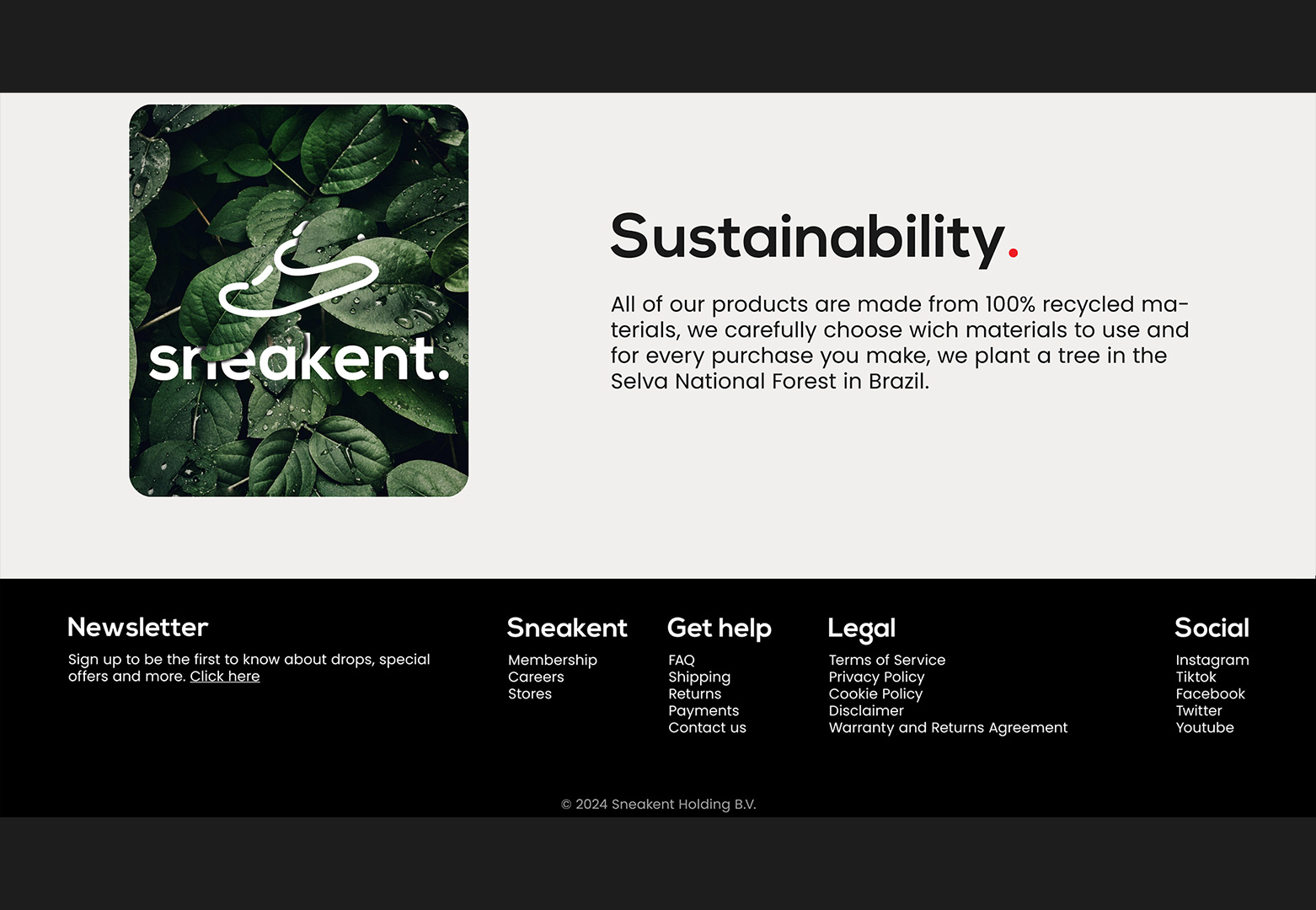
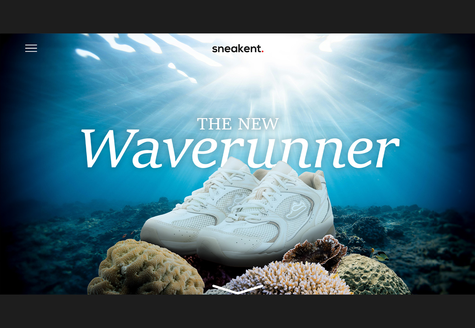
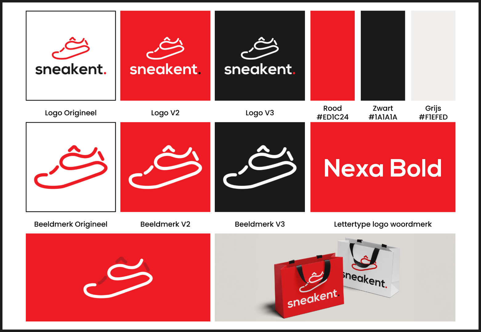
SNEAKENT
SNEAKENT - WEB DESIGN CONCEPT
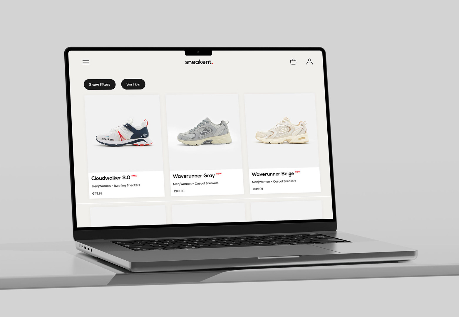
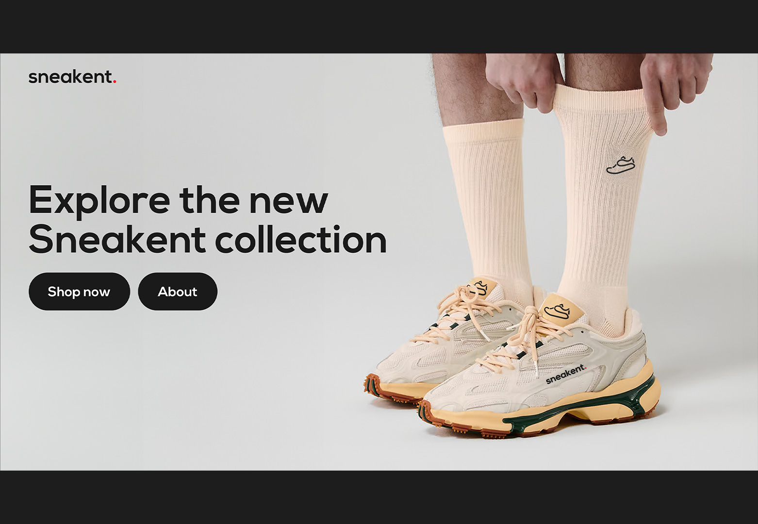
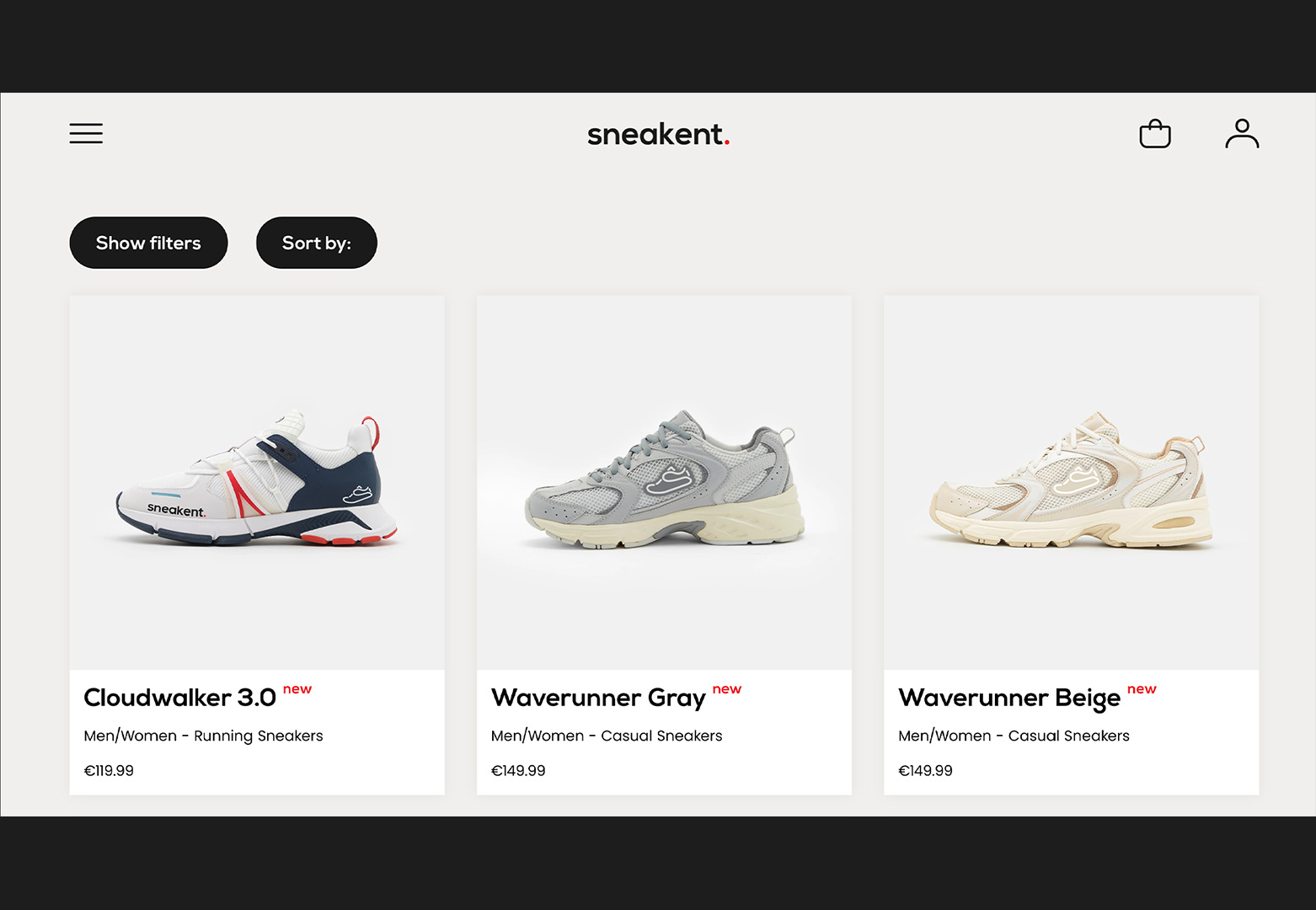
In the final year of my sudies, I worked on a graduation project in which I developed a complete website and visual identity for a fictional brand. I created Sneakent, a name derived from the word ‘sneaker’ combined with my own name, Kentaro. This included designing a custom logo featuring a sneaker with an integrated ”S”. I then designed and developed the website, creating multiple pages with a clean, structured, and user-focused layout.
CATEGORY: WEBSITE
CLIENT: FICTIONAL
TOOL: ADOBE XD
YEAR: 2024
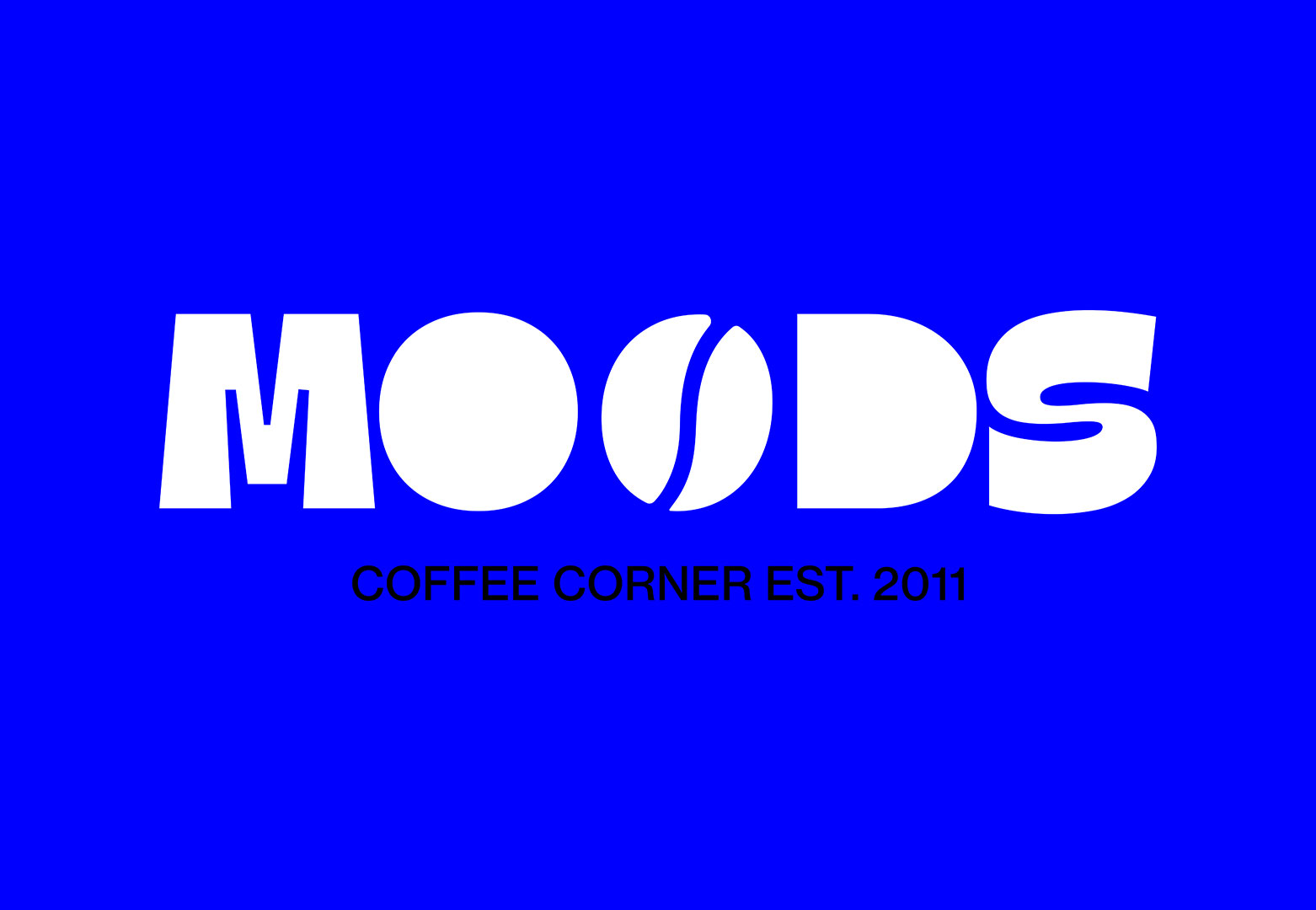
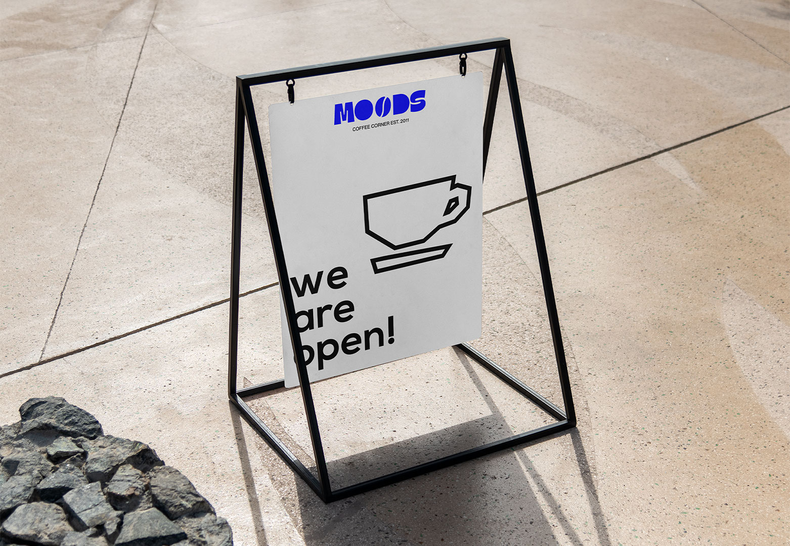
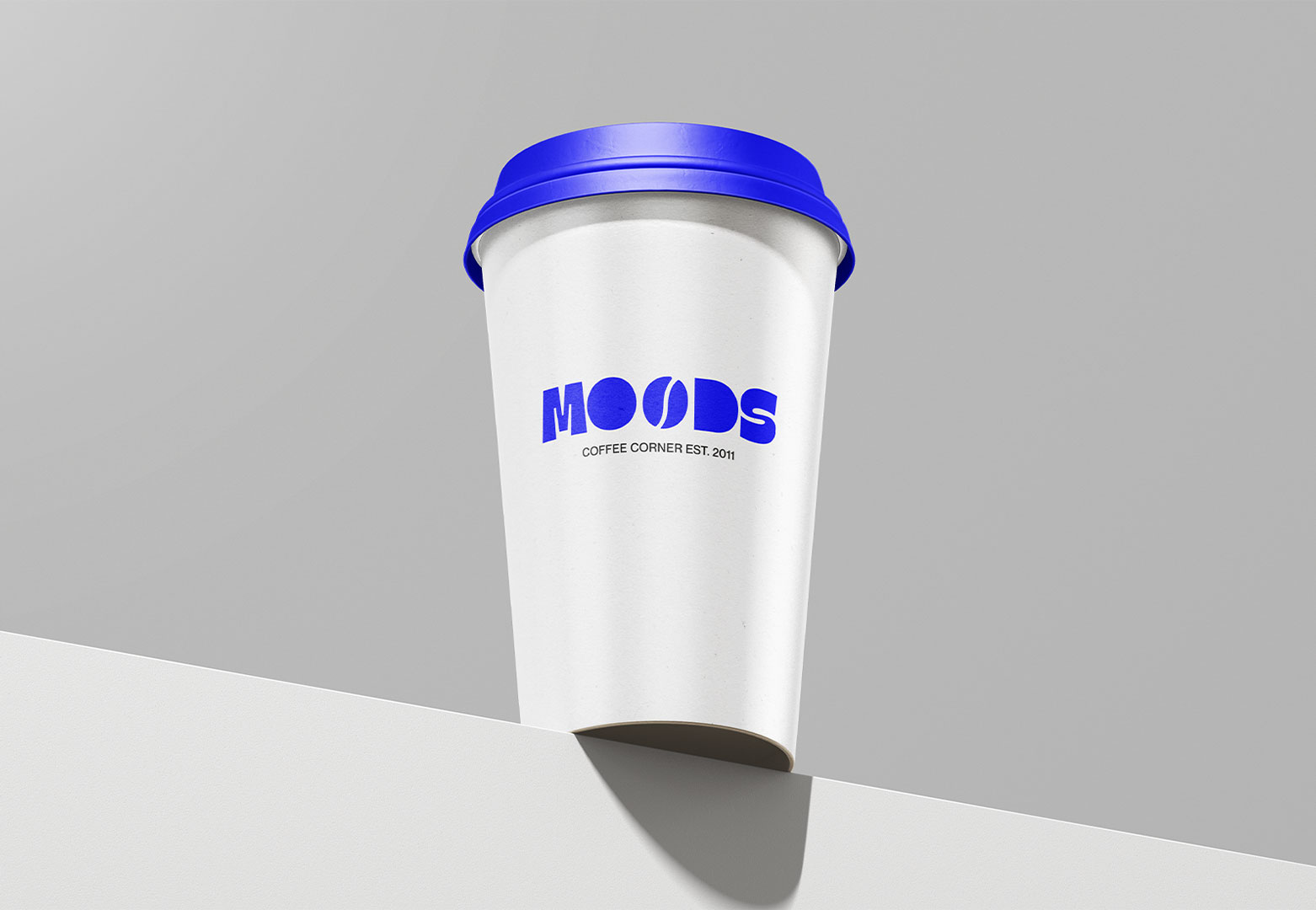
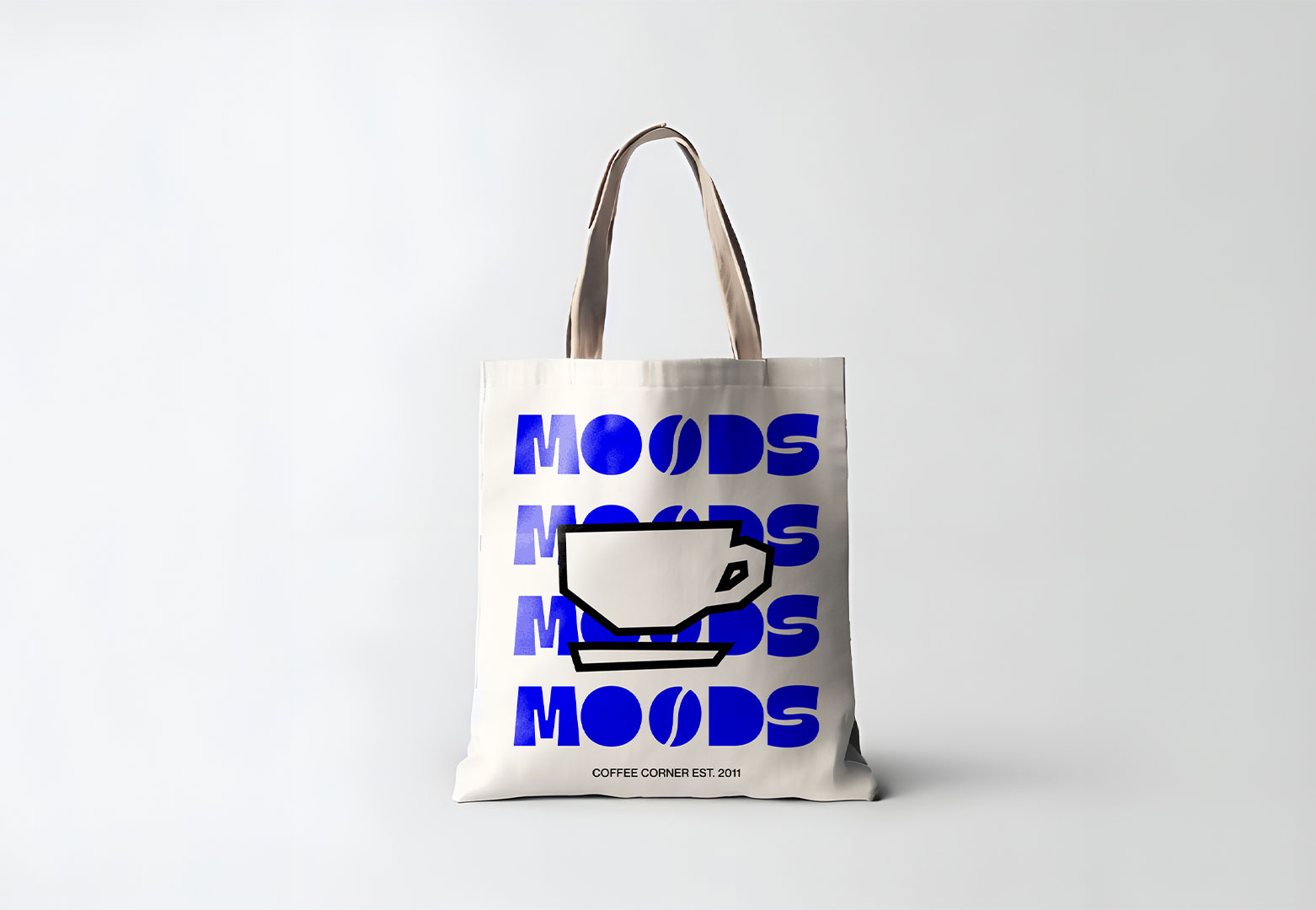
MOODS COFFEE
MOODS COFFEE - LOGO REDESIGN
MOODS is a coffee shop located in Amsterdam. The owners of MOODS asked via social media if anyone would like to design a new logo for their coffee shop. I wanted to stay close to the original logo while giving it a fresh, updated look. I chose a bright blue color, inspired by the blue front door of the building. In addition, I created a set of simple illustrations to introduce a new visual identity alongside this redesign.
CATEGORY: LOGO
CLIENT: MOODS COFFEE
TOOL: ADOBE ILLUSTRATOR
YEAR: 2024
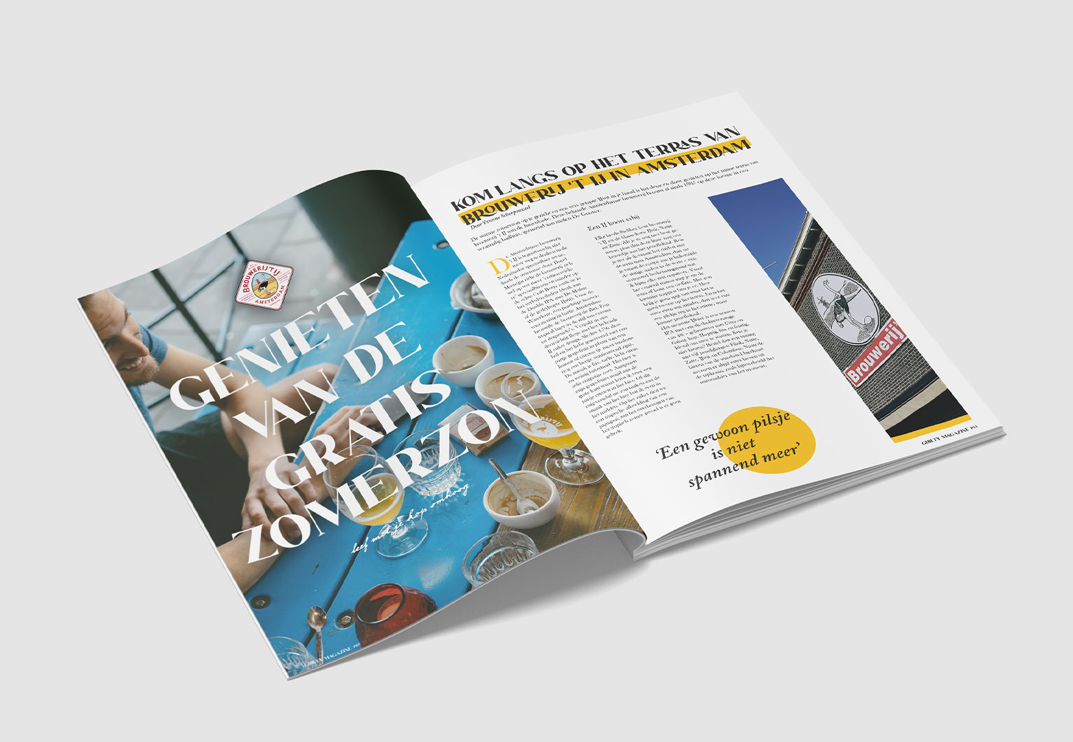
GUILTY MAGAZINE
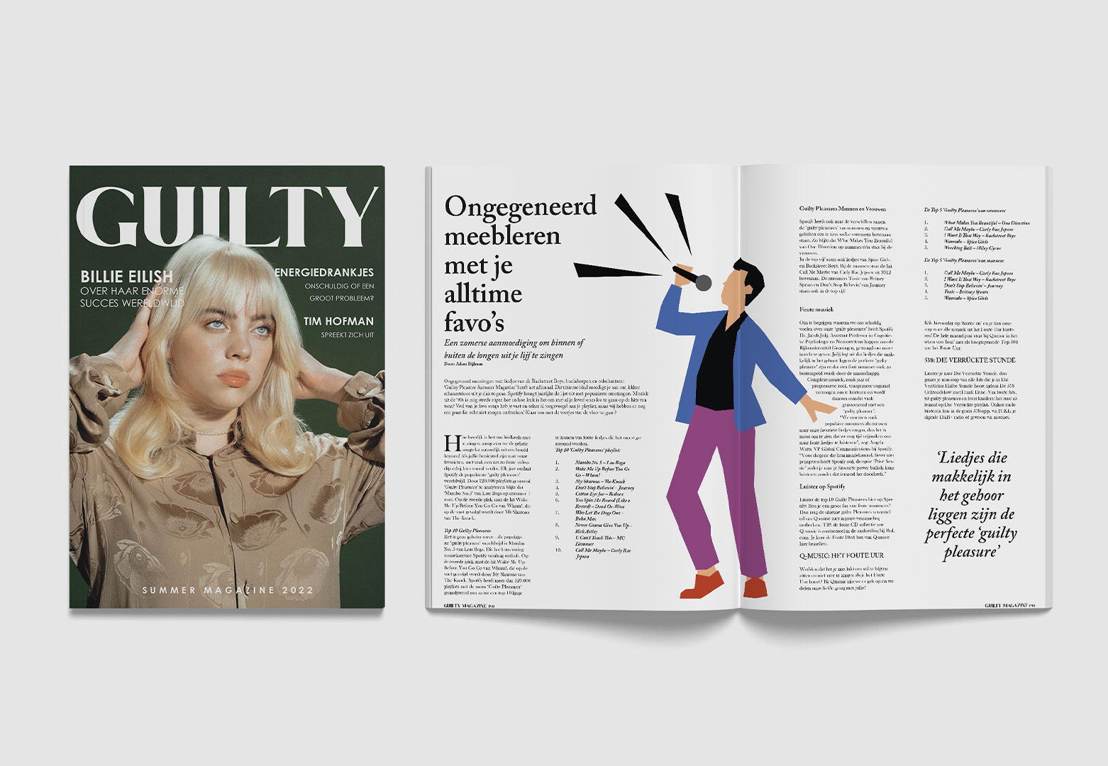
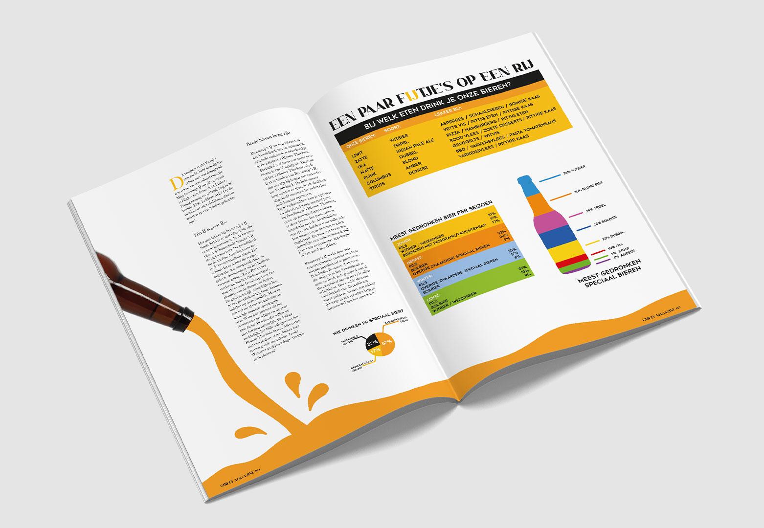
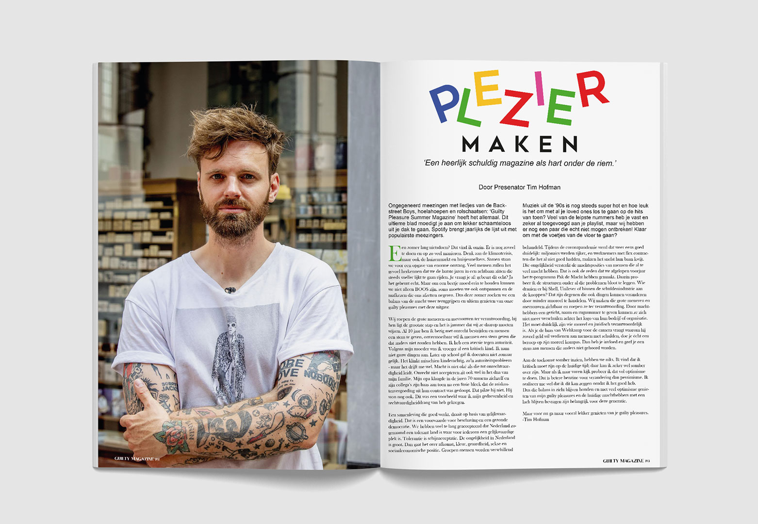
GUILTY MAGAZINE - ACADEMIC PROJECT
During my Graphic Design studies at the Grafisch Lyceum in Utrecht, I was tasked with creating a magazine. The goal was to assess our ability to combine text, images, and layout effectively. We were provided with copy and various images, which we then had to use to produce a magazine called Guilty Magazine. The illustrations and overall design, however, had to be entirely conceived and created by ourselves. It was a very educational project that prepared us as students for an internship period.
CATEGORY: MAGAZINE
CLIENT: FICTIONAL
TOOL: ADOBE INDESIGN
YEAR: 2022
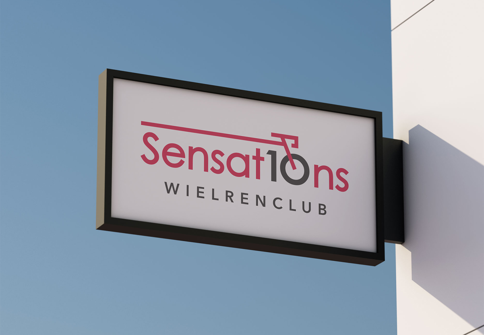
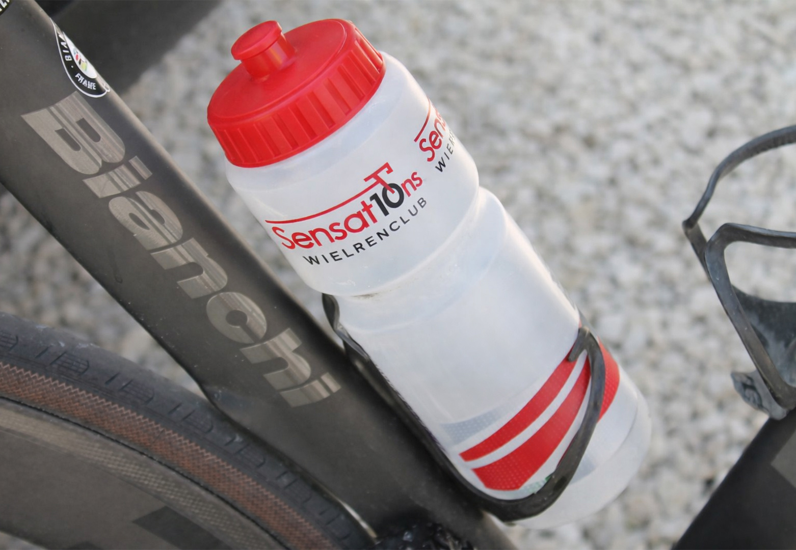
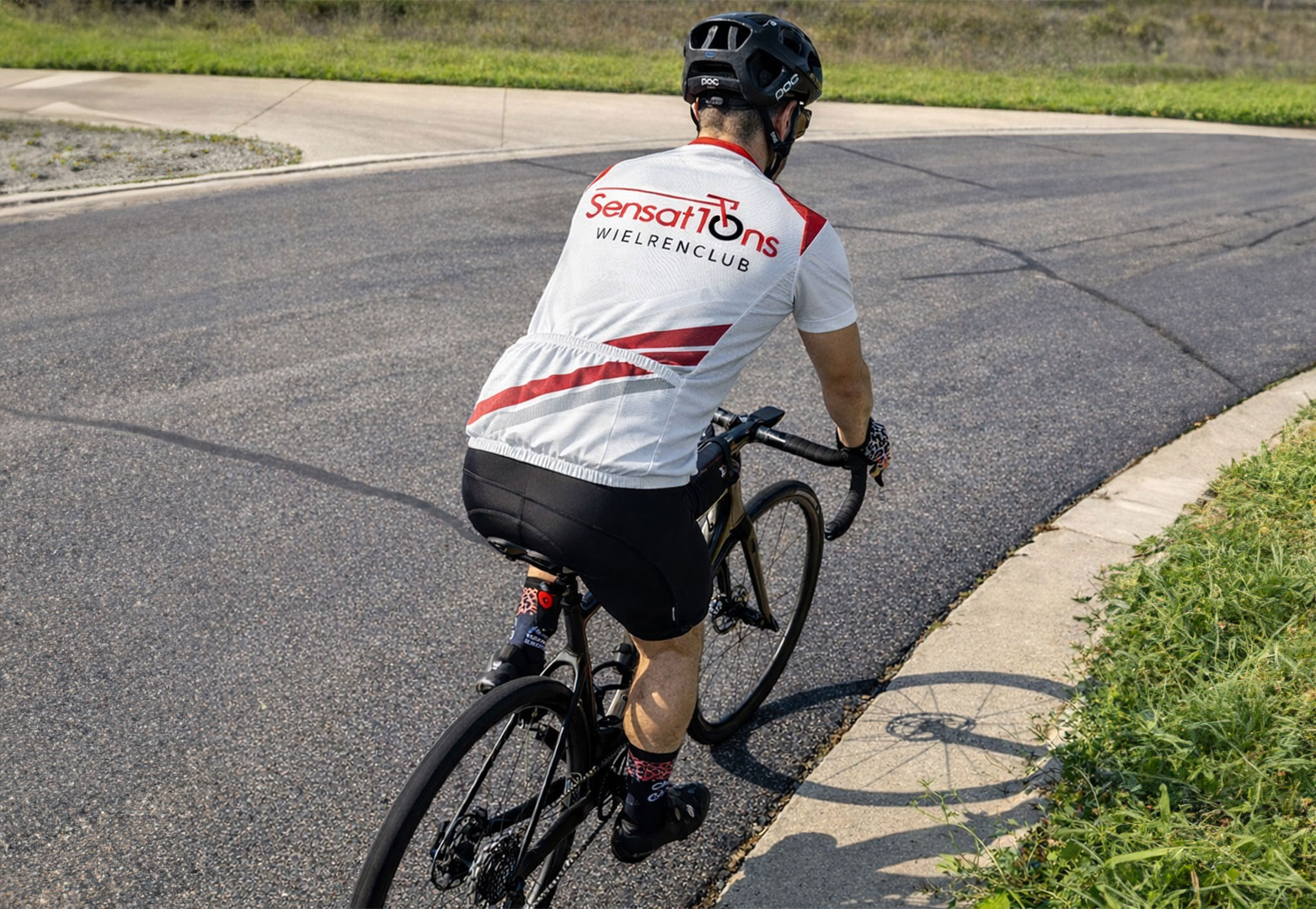
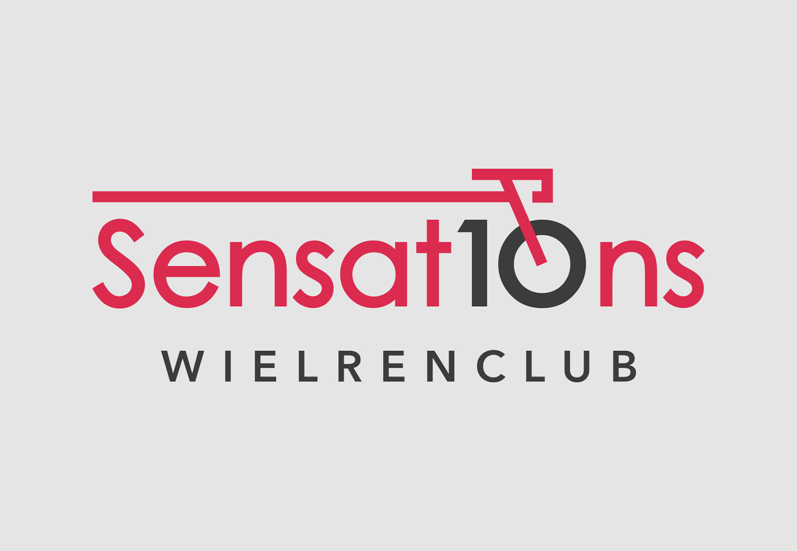
SENSAT10NS
SENSAT10NS - LOGO DESIGN
During my graphic design studies, I was assigned to set up a small advertising agency together with a classmate. As a duo, we received several real client briefs to design logos.
We chose to work for Sensat10ns, a cycling club based in Utrecht, the Netherlands. My concept was to integrate the “0” from the number 10 into the design by transforming it into the wheel of a racing bicycle. The year incorporated into the design refers to 2010, the year the club was founded.